Source note: Local copy of a Summer Into AI 2026 submission originally published on Substack. Screenshots, video, and audio found in the post body are mirrored locally when publicly accessible; profile and avatar images are intentionally not copied. Read the canonical post.
I built an app called Your Town Is Not Fine.
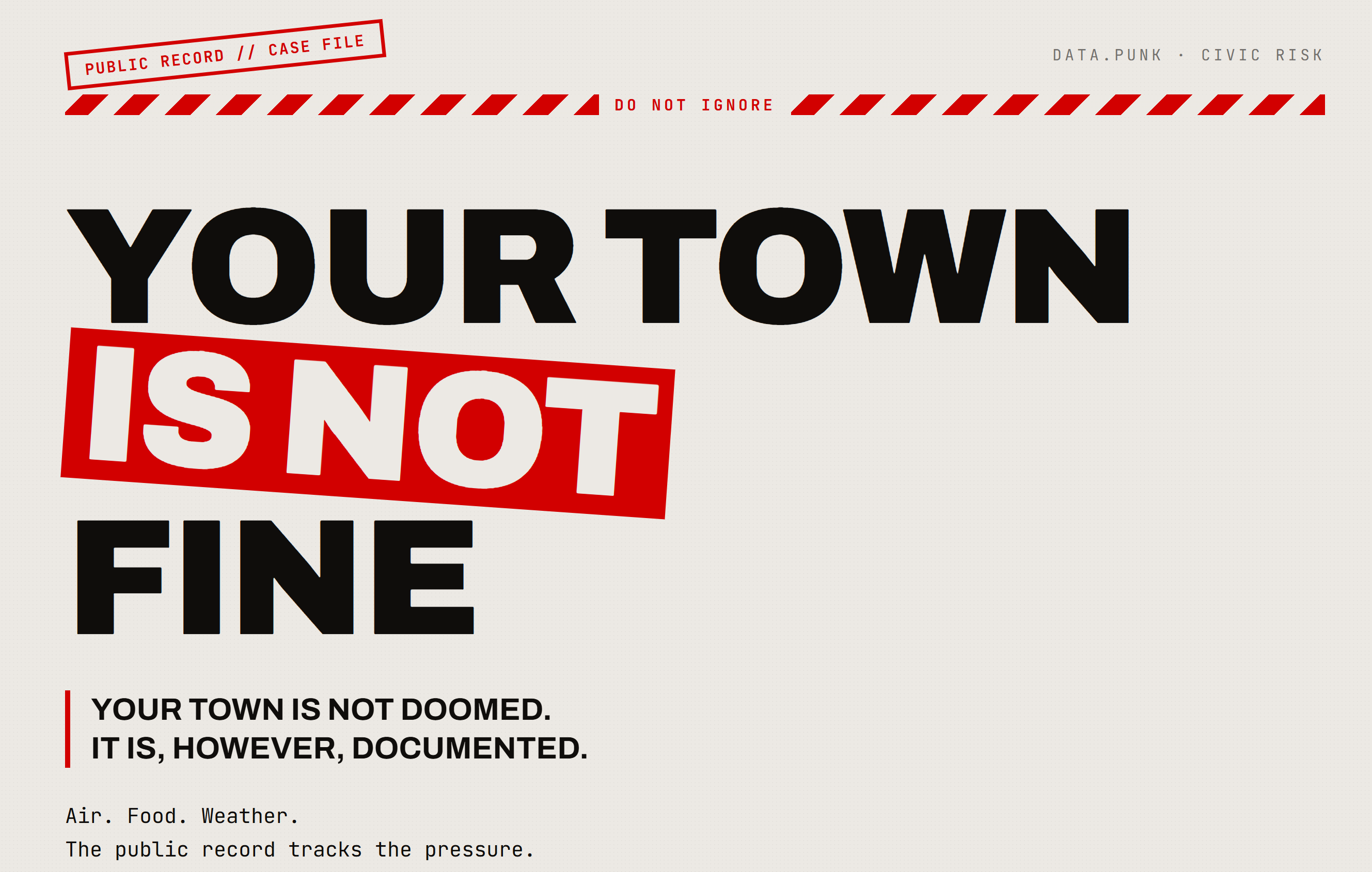
The short version: you enter a U.S. location, and the app opens a blunt little public-data case file about the place.
Not tourism data.
Not “best places to live.”
Not a shiny civic dashboard pretending everything is manageable.
The app looks at three ordinary systems nobody gets to opt out of if survival is the goal:
Air. Food. Weather damage.
It pulls from public federal data and turns the record into something readable:
historical air quality
food access pressure
FEMA weather/natural disaster declarations
Then it gives the place a NOT FINE SCORE and shows the weak points in plain language.
The tagline is:
Your town is not doomed. It is, however, documented.
That is the whole project in one line.
This was my Week 3 submission for Summer Into AI, and the theme was Data.Punk.
Basically: take public data, make it useful, make it weird, make it hit harder than a spreadsheet.
So I made this.
What the app does
You type in a town, city, county, or ZIP.
The app resolves that to county-level data where possible, then opens a report with sections like:
WHAT YOU’RE BREATHING
This uses EPA historical air quality data.
Important note: it is not live AQI. It is the recent record.
The app says that directly:
This is not a live air reading. It is the recent record.
Because a bad day is one thing.
A pattern is another.
And the file line is:
You do not visit the air. You live inside it.
THE SUPPLY LINE
This uses USDA food access data.
I wanted this section to be about infrastructure, not personal choices. Food access is not a character test. It is a map problem. A distance problem. A transportation problem. A money problem. A systems problem.
The line that came out of that section:
The crisis does not always start with an empty shelf. Sometimes it starts with a store that was never close enough.
HOW IT GETS YOU
This uses FEMA disaster declaration data, filtered to weather and natural disasters.
Severe storms. Floods. Hurricanes. Fire. Tornadoes. Snow and ice. Drought. Earthquake. Landslide.
The app looks at the official county record and says: this is the kind of damage that keeps showing up here.
Not because the app can predict the future. It cannot.
Because the record already has fingerprints on it.
What it looks like
I did not want this to look like Civic Dashboard Template #437.
No soft gradients.
No rounded little wellness cards.
No “community insights” stock-photo energy.
The target was more like:
The government posted the data. Someone tore it down, photocopied it badly, circled the weak points in red marker, and stapled it to a wall.
Think:
1980s punk flyer
bad photocopy
public notice
warning label
zine table
red marker
black ink
dirty paper
case file
Not cyberpunk.
Not vaporwave.
Not sleek tech dystopia.
More like a municipal report got shoved through a basement-show copier and came out angry.
The big landing page headline is:
YOUR TOWN
IS NOT
FINE
Which is not subtle.
That was the point.
Why this fits Data.Punk
The thing about public data is that it is often technically public and functionally buried.
It exists.
Sure.
In a giant spreadsheet.
In an API endpoint.
In a PDF.
In a download with 47 columns and a government naming convention that makes your eyes go dead.
That is not the same thing as readable.
That is not the same thing as usable.
That is not the same thing as public in any practical sense.
So the Data.Punk move here was not just “use a dataset.”
It was:
Take the official record and strip out the polite fog.
The app does not say:
Environmental indicators suggest potential area-level concern.
It says:
The air record shows pressure. Not a single event. A condition.
It does not say:
Food access varies across census tracts.
It says:
The map makes food harder to reach in places where failure costs more.
That is the whole attitude.
The record is public.
The damage is ordinary.
Nobody fixed the system.
Here is the file.
The score
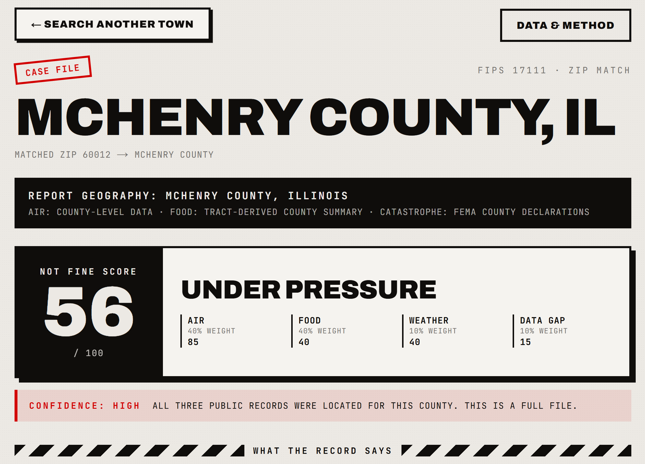
The app creates a NOT FINE SCORE from 0–100.
To be very clear: this is not an official federal score. It is not an EPA, USDA, or FEMA category. It is an app-defined signal.
The MVP formula is:
40% historical air quality
40% food access pressure
10% catastrophe indicator
10% data weirdness / source limitations
The labels are intentionally blunt:
CLEANER THAN EXPECTED
STILL HOLDING
UNDER PRESSURE
FRAYING AT THE EDGES
THE LINE IS THIN
I wanted the score to feel like a warning stamp, not a school grade.
No town is “bad.”
No residents are being judged (out loud).
The score is not about the people living there. It is about the systems around them.
One of my hard rules for the project was:
Hard on the conditions. Never hard on the people.
That stayed on the wall the whole time.
Metaphorically.
Although honestly, for this project, it probably should have been literally taped to a wall in red marker.
The data sources
The final app uses processed JSON files built from public datasets.
Not the raw monster files. Those are too large and clunky for the front end.
The source data came from:
EPA AirData
Historical annual AQI by county, 2020–2024.
This powers the air section.
USDA Food Access Research Atlas
Food access indicators, originally at tract level, summarized to county.
This powers the supply line section.
FEMA Disaster Declarations Summaries
Weather and natural disaster declarations grouped by county.
This powers the catastrophe section.
I had to do a cleanup pass here because the first version let Biological/COVID declarations show up as the dominant disaster type in some places.
That was real FEMA data.
It was also wrong for this app.
The “How It Gets You” section is about weather and natural catastrophe patterns, so I filtered the file to the relevant incident types.
A punk interface with sloppy data is just costume.
The file has to be honest.
The geography problem
One thing I ran into fast: location data is annoying because humans and datasets do not talk about places the same way.
People say:
“Des Moines.”
Federal datasets say:
“Polk County, Iowa.”
Or they say census tract.
Or county FIPS.
Or ZIP.
Or monitoring region.
Or some other geography that almost, but not quite, matches the way a normal person thinks.
So the app shows the report geography clearly.
Example:
REPORT GEOGRAPHY: POLK COUNTY, IOWA
AIR: COUNTY-LEVEL DATA · FOOD: TRACT-DERIVED COUNTY SUMMARY · CATASTROPHE: FEMA COUNTY DECLARATIONS
That matters.
The app should not pretend the data is more precise than it is.
One of the method rules is:
Missing or broader data lowers confidence, not safety.
If the file is incomplete, the app should say the file is incomplete.
It should not magically make the town safer.
It should not magically make the town worse.
No fake precision.
No clean bill of health.
No pretending a blank cell is good news.
What still holds
The app is not an emergency system.
It does not send alerts.
It does not predict disasters.
It does not diagnose health conditions.
It does not measure every local risk.
It does not replace official sources.
It is a file.
So the final section is called:
WHAT STILL HOLDS
Not “solutions.”
Not “five easy steps.”
Not “empower your community with resilience.”
No thanks.
Just practical things the file should make you check:
Find your county emergency alert system.
Check current air readings before hard outdoor work.
Know the nearest reliable grocery options.
Keep water, light, and phone power covered for a short outage.
Know the flood map if water is the local break point.
Check official sources when weather turns.
And the three lines I like best:
Do not wait for the siren to learn where the alerts are.
Do not wait for smoke to learn where the air data lives.
Do not wait for the shelf to learn how far the next one is.
That is probably the actual heart of the app.
The design is loud.
The language has teeth.
The whole thing is wearing a black jacket it definitely found at a thrift store.
But underneath that, it is simple:
Read the file before the system fails in front of you.
What I learned
Public data is weird because it is both available and buried.
Not buried like secret.
Buried like: technically downloadable, emotionally hostile.
A spreadsheet can be public and still be unusable to most people.
A dataset can be official and still need translation before it becomes civic knowledge.
A report can satisfy the requirement and still fail the human reading it.
That feels like the Data.Punk part to me.
Not just using public data.
Refusing to leave it in a locked filing cabinet with the door open.
This project made me think a lot about how much of civic life is already documented somewhere. The air record is there. The food access record is there. The disaster declarations are there.
The public record has been keeping receipts.
The app just opens the file and says it without the beige wallpaper.
Your town is not doomed.
It is, however, documented.
Eric
Original source
Canonical Substack URL: https://xblueundertow.substack.com/p/your-town-is-not-fine.