Source note: Local copy of a Summer Into AI 2026 submission originally published on Substack. Screenshots, video, and audio found in the post body are mirrored locally when publicly accessible; profile and avatar images are intentionally not copied. Read the canonical post.
My girlfriend Natasha rehabilitates bats in Des Moines, Iowa. So when this week’s theme landed — go find the boring federal data nobody turned into anything, because the government never built an app for it — I knew exactly which dataset I wanted to drag into the light.
In the winter of 2006, in a cave near Albany, New York, someone photographed hibernating bats with a strange white fungus on their faces. It was the first sign of white-nose syndrome. In the thirteen winters since, it has crossed the entire continent — Seattle to the Carolinas — and killed millions of bats. The U.S. Geological Survey tracked it the whole way, county by county. And then they left it sitting in a stack of frozen GIS layers that nobody outside the agency will ever open.
So I built WHITE NOSE: a map that lets you watch the plague spread.
In one breath: white-nose syndrome is a cold-loving fungus (Pseudogymnoascus destructans) that grows on bats while they hibernate, jolts them awake all winter, and makes them burn through their fat reserves and starve before spring. It doesn’t kill one bat at a time — it empties whole caves. 90–100% of a colony, gone in a season.
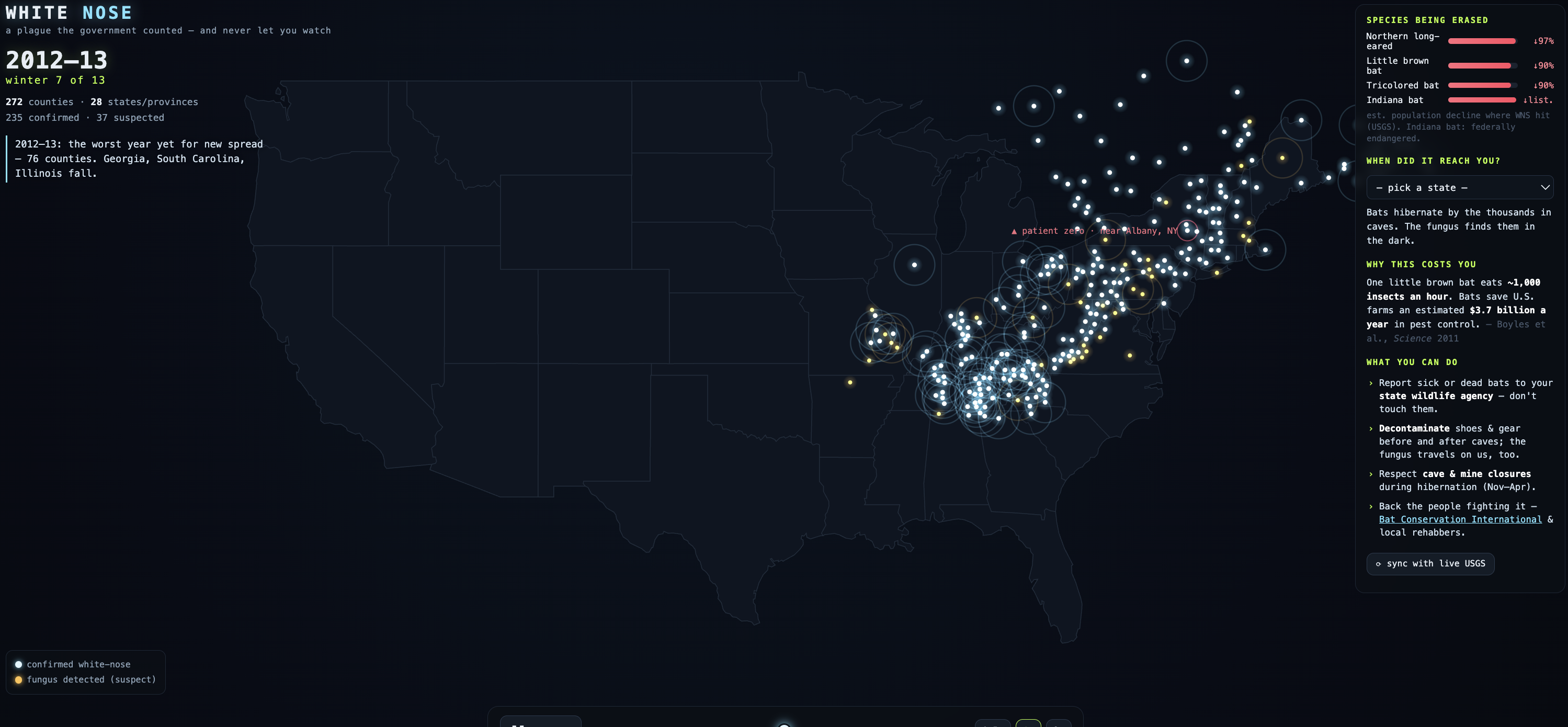
Open the page and press play. Each glowing dot is a real county where USGS recorded the disease, lighting up the exact winter it arrived. You watch the white bloom out of that one cave in New York, creep down the Appalachians, fill the Midwest — and then, in 2015–16, leap 1,300 miles to Washington State in a single jump nobody saw coming. Then Texas. The Plains. California. The map fills the way the real thing did: slowly, then all at once.
Hover any county — name, state, the winter it was hit, confirmed vs. suspected.
“When did it reach you?” — pick your state and the map tells you the winter WNS arrived and lights up your counties.
“Species being erased” — the three hibernating species WNS has hit hardest are down more than 90% where it struck; the northern long-eared and Indiana bats are now on the endangered list.
Season-by-season, the real history scrolls past: the naming of the disease, the day scientists identified the fungus, the USFWS estimate of 5.7 million dead, the leap west.
“Sync with live USGS” — one button re-pulls the occurrence data straight from the government’s own server, live, and rebuilds the map in front of you. Proof it’s the real federal record, not numbers I typed.
“What you can do” — it doesn’t just make you sad and leave you there: report sick/dead bats to your state wildlife agency, decontaminate your gear before and after caves (the fungus rides on us too), respect cave closures, support the rehabbers. Civic participation, which is the whole point of the theme.
Why this is the punkest thing I could find. The theme said it’s punk because the government never built apps for this data. This is the literal version of that sentence. The data is real, it’s federal, it’s public — and getting it meant digging through the USGS’s ArcGIS servers, where the obvious “official” spread layer is quietly frozen at 2013 and you have to know to go find the 2019 snapshot with the other 274 counties in it. The catastrophe is fully documented and almost completely unseen. All I did was make it move. That’s the whole job: take the thing they counted and refused to show you, and show you.
An honest note on the data. The freshest county-level federal release is the October 2019 snapshot — so the map runs 2006 → 2019 (13 winters, 555 counties, 45 states and provinces). The disease has kept spreading since (it’s now in ~40 states), but the feds haven’t re-published it at this resolution. Everything you see is the real occurrence record, baked into a single self-contained file. No tracking, no server — the data ships with the page.
This isn’t abstract for us. Pick Iowa on the map and you’ll see the white reached it in the winter of 2014–15 — the bats Natasha treats in Des Moines live in a state this federal record already turned. The data stops in 2019. Her night shift doesn’t.
A nod to Eric. Eric set this theme — go get that ‘murica data — and the framing is what unlocked this for me. Most “data” builds are a dashboard. I wanted the one that makes you feel something: a real federal dataset that turns out to be a quiet apocalypse nobody animated. Thanks for the push, Eric.
This one’s for Natasha, and for the wildlife rehabbers on the night shift — the people who warm, feed, and fight for these animals one bat at a time, while the rest of us never even saw the map. 🦇
Watch it spread (it all runs locally — the federal data ships inside the page):
▶️ Live: https://myles-mf.github.io/summer-into-ai-2026/week-3/
💾 Source (one file — read the data and the render): https://github.com/myles-mf/summer-into-ai-2026/blob/main/week-3/index.html
🗂️ Everything I’ve built for the contest: https://myles-mf.github.io/summer-into-ai-2026/
Also written up on my site: https://merlinforge.com/blog/white-nose-week-3/
Punk isn’t dead. It’s compiling. ★
Original source
Canonical Substack URL: https://merlinforge.substack.com/p/white-nose-the-government-counted.