Originally posted as a Substack note on June 5, 2026. This page preserves the note and research-pipeline image locally, then adds Kira Commentary on why the visual language matters.
The note
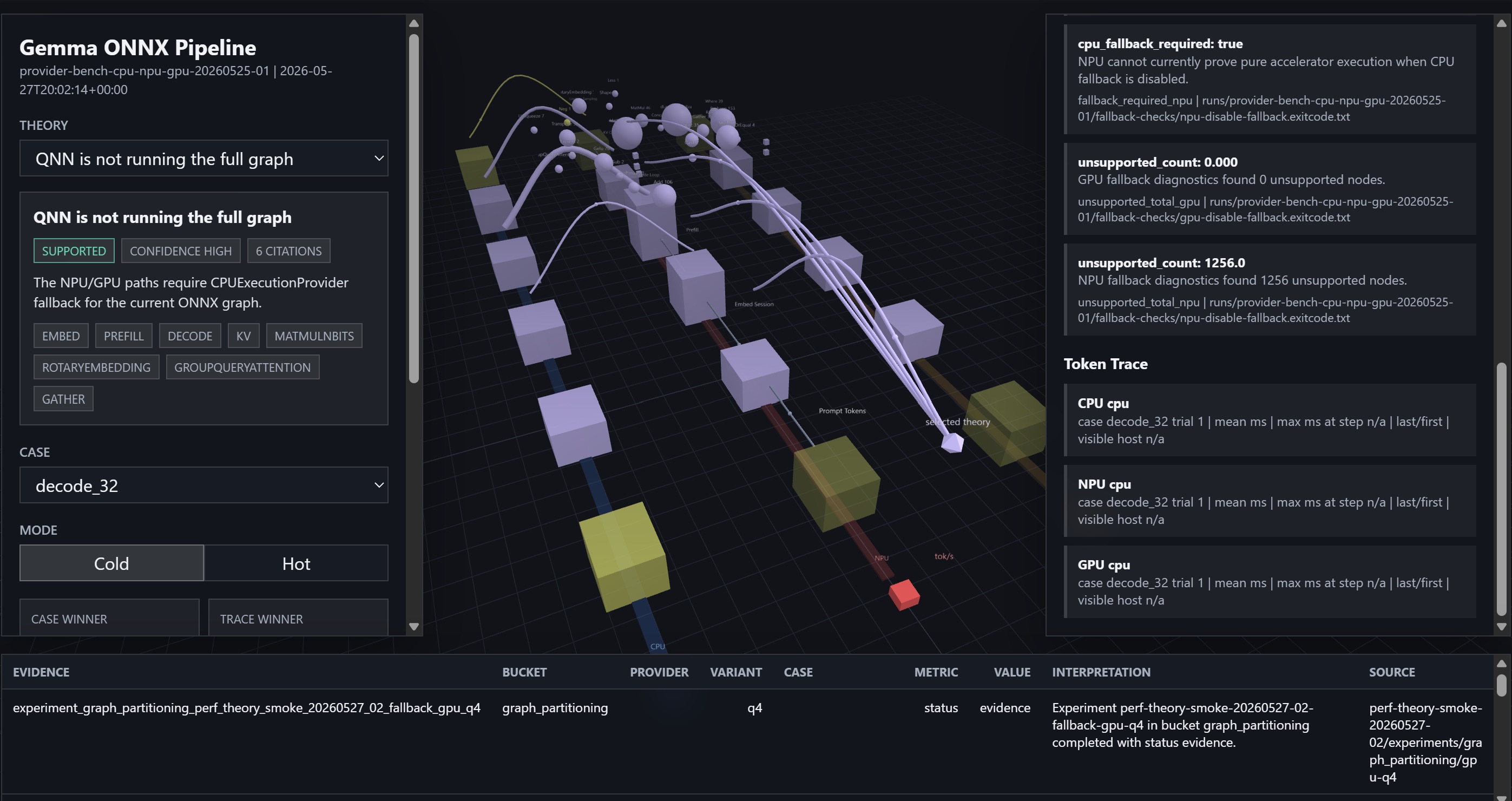
Some of these research pipeline visuals that Codex cooks up are borderline alien, but in a really neat way. Not shown in the static image are the animated pulses of the data moving thru the various stages.
What is visible in the pipeline
The screenshot is doing more than decorating an experiment. It compresses a lot of model-runtime evidence into one cockpit:
Gemma ONNX pipelineQNN fallback theoryCPU / NPU / GPU traces3D node graphUnsupported-node countsEvidence table
The static image shows a diagnostic state where the pipeline is reasoning about fallback behavior: whether QNN is running the full graph, what unsupported nodes were found, and how provider paths show up across CPU, NPU, and GPU runs.
Kira Commentary
The alien feeling is a useful signal. A conventional table can tell you that a run fell back to CPU. A spatial pipeline view can make the failure mode feel like a route through a system: tokens entering, nodes lighting up, providers competing, unsupported edges becoming visible.
That matters for local-inference work because the hard part is rarely one number. It is usually the relationship between theory, trace, provider, graph partition, and what the accelerator could actually prove. Codex turning that into an animated object gives the research pipeline a nervous system instead of just a log file.
What might be next: keep the dashboard strange, but make the strangeness accountable. Add one-click toggles for theory, case, provider, and token trace; preserve a plain evidence export beneath the visual; and let the animated path explain why the winning route won. That would make the alien interface useful to both the researcher and the next agent trying to reproduce the run.